
Portfolio Redesign Project
Personal branding system design to showcase my work with confidence, clarity, and personal branding.
Project Date: Spring 2026
Project Overview: My personal brand style guide hones in on the visual and verbal cohesiveness for my personal brand. This project included developing a logo system, color palette, typography, bio variations, voice and tone guidelines, target audience, core values, mission statement, message architecture, and brand vocabulary. The final guide I curated is a good foundation for the future website updates, social media content, coaching materials, and personal brand experiences.
The Problem: As I continue to grow in personal branding, creative, and as a confidence coach, I need a brand identity that clearly reflects who I am and the people I serve. My work is centered on helping women build confidence, clarity, and a personal brand presence that feels true to who they are. I needed a consistent brand guide that communicated my mission well.
I want to create something that aligns with what I shared on other platforms and previous branding products. Something that felt polished and professional but was still personal and authentic to me. When people saw or read something that would connect my personal brand with that.
The Solution: To address this inconsistency, I created a personal brand style guide that brings together the visual and messaging elements of my brand. I started by defining who I serve, what I value, and how I want people to feel when they interact with my content or services.
The tagline sums up my brand clearly:
Helping women build confidence, clarity, and personal brand presence.
My tagline shaped the rest of the brand system because it clearly communicates the purpose behind my work. My brand focuses on helping women understand their story, own their voice, and show up with confidence in both personal and professional spaces.
Visual Identity
Visually, I wanted my brand to feel fresh, confident, and approachable. I created a logo system using both my full name, Rylee Wright, and an RW monogram. This gives some flexibility across different platforms, from website headers to social media profile images and branded graphics.
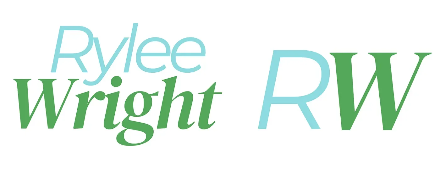
Logo Variations
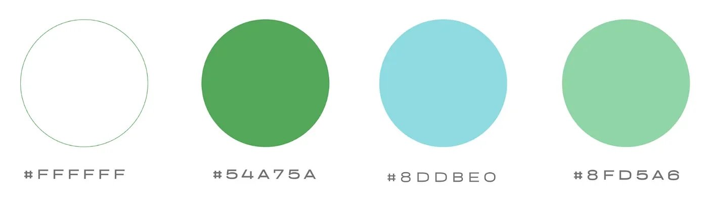
Color Palette
The color palette really represents the feeling of my brand well. The green represents growth and purpose, whereas the light blue creates a sense of clarity, calmness, and trust. The other colors are supplementary and will be used to add contrast and dimension in different spaces.
Typography
The typography was chosen to balance my personality with cleanliness. DM Serif Display Italic is the primary headline font (H1) because it feels bold yet personal. Montserrat Italic and Montserrat Regular bring in a clean, but elevated feel for subheadings and body copy. Arial is used as a simple font for more practical design pieces.
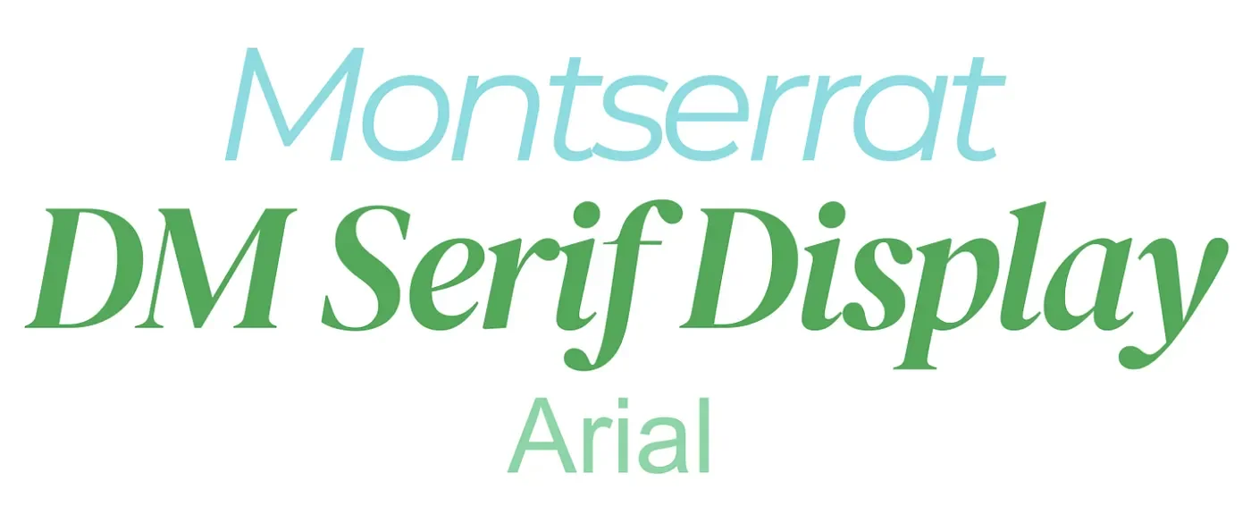
H1 — DM Serif Display Italic, H2 — Montserrat Italic, H3 — Arial, Body — Montserrat Regular
Brand Messaging
After building the visuals, I really focused on the brand’s intentional voice and tone. I wanted the brand to sound like a mentor, an encourager, a strategist, and a friend all in the same. The voice needed to feel warm and encouraging, but not cheesy or overly motivational.
Brand Voice
Encouraging, warm, confident, honest, empowering, thoughtful, and uplifting.
I also developed a message architecture around five key points:
Confidence, Authenticity, Clarity, Purpose, Growth
To keep my brand consistent, I created vocabulary guidelines that define which words fit the brand and which phrases should be avoided. Words like confidence, clarity, purpose, presence, authentic, intentional, empowered, meaningful, growth, and bold are strong and showcase the heart of my brand very well.
Voice + Tone Guidelines:
Target Audience
Women building a personal brand
Young professionals navigating confidence and career growth
Aspiring entrepreneurs and creatives
Women who want to communicate who they are with more clarity
People seeking encouragement, empowerment, and strategy
Results: The final version of my personal brand style guide gives my brand a clear identity that was missing. The visuals support my brand so well, but that is because I was able to really hone in on my mission and the direction that I see myself building and growing into in the future. I hope to attract a strong social media presence, coaching materials, digital content, and future brand extensions that will support both my brand and business.
This project was the highlight of my semester. The visuals are important, but the mission and message really have to be clear and true to who I am.